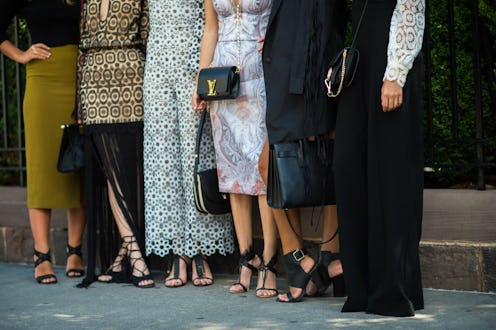
(Fashion)
Introducing The Zoe Report’s New Look

MAJOR news. The Zoe Report just got a glamorous upgrade, and we couldn’t be more proud to welcome you to our new site. Check out our guide to everything new and improved below and when you’re done, be sure to explore the same content you know and love and experience our new site for yourselves. We can’t wait to hear what you think, so don’t forget to leave your comments below!
So, what's new?
Introducing Comments
We want to hear what our Zoe Reporters think about everything happening in the worlds of fashion, beauty and more. That's why every story will now have a commenting feature included so that you too can join the conversation.
Enhanced Navigation
We know that fashion girls are always on the go. That's why we want you to get your daily fashion-fix in the most seamless way possible. With our new streamlined top navigation bar featuring updated categories, a sticky header and 'next up' story recommendations, The Zoe Report is easier to navigate than ever, giving you access to even more amazing stories, every day.
Long-Form Posts
An enhanced "magazine style" in our long-form content will elevate in-depth stories with a beautiful mixture of imagery, pull quotes and font treatments making it easier for you to read and engage.
Squeaky Clean
Our sleek new design is not only easier to navigate, but it's easy on the eyes, too. With larger, stunning imagery of everything from the latest fashion trends and runway shows to inspirational women and style icons, you won't be able to turn away from our crisp and clean layout no matter if you're reading on your phone, tablet or laptop.
Social Sharing
We understand the power of the social, so we're making sure our fashion-savvy readers can easily share all of the content they love on their favorite platforms. With Pinterest icons on every image and bigger, more prominent 'Facebook', 'Pin' and 'Tweet' buttons on each and every post, social sharing just became beautifully simple.