(Celebrity)
Taylor Swift's 'Anti-Hero' Decor Is A Modern 1970s Dream
She’s moved on from Cottagecore.

If there’s one thing Taylor Swift fans are going to do, it’s look for clues. So when the ever-evolving musical artist announced at the 2022 MTV Video Music Awards that she would soon be dropping a new album, Midnights, her faithful listeners were quick to come up with theories about the creative direction and content. The cover art, which featured her in moody lighting with glittery cat eye makeup, had many anticipating a Tumblr-era/mid-aughts aesthetic, but that’s not the only nostalgic element you can expect from her latest effort: Swift’s “Anti-Hero” music video proves she’s also having a moment with ‘70s style decor — and it just might inspire you, too.
Much like pop star pioneers Madonna and Janet Jackson, Swift seems to redefine herself with each album — from her lyrical content to her bang length — and her aesthetic choices in videos have led to decor trends before. Last year when she released Folklore, Cottagecore enjoyed a wave of popularity, and now “Anti-Hero” looks to have a similar effect with its 1970s-via-mid-2000s vibe.
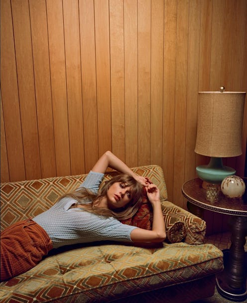
Led by Swift as Director, Rina Yang as the director of photography, and Ethan Tobman as production designer, the video is decidedly nostalgic in its visuals — or as Christine Lemieux, founder/designer of Lemieux Et Cie, calls it, newstalgia. “I would point it right to The Brady Bunch home,” Lemieux tells TZR. “Taylor could have filmed the whole thing with the Bradys. It’s vintage 1970 to 1974. This was the end of the OG Mid-Century [Modern] right before design embraced ‘70s deco revival.” The video embraces some of the hallmark element of the time period, including geometric patterns, a muted color palette, and lots of clean lines juxtaposed with natural materials.
While the set design in “Anti-Hero” is obviously inspired by the 1970s, Taylor also adds her own unique touches to bring this trend into the 2000s, which you can also accomplish by mixing vintage pieces with contemporary ones. Not sure where to start? We asked a few interior experts to share which design elements were easy to replicate, plus some tips on how to incorporate them in your space — whether you’re looking to transform just a nook of your home or the entire environment. Get all their advice ahead.
We may receive a portion of sales if you purchase a product through a link in this article.
Patterned Wallpaper
“To achieve an overall feeling in a space, pattern and texture will change the mood immediately,” explains Layne Povey, principal designer at The Lynden Lane Co. And this is proven true in the “Anti-Hero” video, in which every room features walls covered with bold prints including plaids, florals, and stripes. To really zero in on the ‘70s feel, Povey says to opt for colors like avocado, copper, and burnt orange. As for the prints, check out those with geometric or curvy shapes.
Muted Tones
A harmonious color theme is one of the most impactful elements of “Anti-Hero.” “There are lots of muddy tans and reds, navy, and olive green, plus pops of jewel tones like teal, citrine and chartreuse,” says Chrissy Morford, Minted's GM of art and direct from artist. Even traditionally bolder hues like turquoise and red are featured in a more subdued palette, so when you’re paint shopping, look for colors that are muted yet saturated.
Angular Furniture
“This is a solid example of mid-century modern design,” Morford explains. “The streamlined forms and simple, organic shapes make the rooms feel inviting.” If you’re not interested in combing through vintage pieces for the perfect seating, you’ve got so many modern interpretations to choose from that are similarly sleek, sculptural, and low-slug, like the sofa featured in the “Anti-Hero.” You can opt for one in the aforementioned palette to copy the video’s matchy-matchy aesthetic or stick with a neutral if you’re trying to bring your space more into the present.
Moody Lighting
In order to achieve the dim, moody atmosphere in Swift’s video, skip harsh overhead lighting in favor of table lamps, desk lamps, pendant lights or chandeliers, and sconces, which will give you a warm, cozy glow.
Graphic/Abstract Artwork
If you watch closely, you’ll notice a gestural, abstract painting featured in one of the rooms in “Anti-Hero,” and that’s right in line with artwork popularized in the 1970s. But you can also choose from a few different styles and still stay true to the time period, according to Morford. “Brutalist architectural artwork had a moment in the ‘70s,” she says. “As did abstract works rich with red, brown, and yellow hues.” And since you probably can’t get your hands on Pollock or a Le Corbusier for your home, she suggests checking out Minted’s plethora of works inspired by this era. “We work with Japanese artist Yohaku Oshima and she does a fantastic job of creating sculptural compositions and geometric patterns that feel modern,” the design expert shares. “Another artist, Ukrainian born and Barcelona-based Alisa Galitsyna, creates collages and abstracts inspired by nature and architecture. Alisa’s best-selling Black Plant – Earth artwork was just launched as a Block Printed Textile, a new collection designed by Minted artists and handcrafted in India.”
Natural Elements
“The wood-paneled walls and furniture bring the outside in, adding a healthy dose of nature to the overall look,” Morford says. “Super cozy in my opinion!” That said, the look simply isn’t practical for every home. “If dark wood paneling feels like a big commitment, try bringing warm tones into your space with art frames,” she adds. “Especially when paired with nature-inspired artwork, clean-lined wood frames can help a space feel calm and cozy. We’re seeing that walnut wood frames are popular right now, so choosing that finish would feel retro and modern all at once.” And Povey adds that cane chairs are another more streamlined option of including some elements that feel earthy and natural.