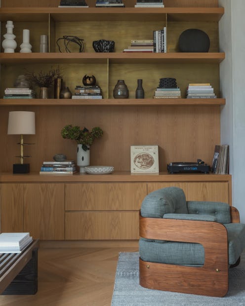
(Decor)
Got Bookshelf Envy? 4 Ways To Style Yours, According To An Expert
It's easier than you think.

You’ve just acquired a new bookshelf. Maybe it’s contemporary and took you no time to find at all, or maybe it’s vintage, the culmination of months of scouring the internet and weekend antiquing. Either way, you’ve finally managed to get it home, picked out its rightful place, and you’re just stepping back to admire it when you think, “Wait a minute...how am I going to style this?” Listen, we’ve all been there. Gone are the days when a prominently displayed bookshelf simply housed the novels you promised you’d get around to reading. Now, one can’t get through an Instagram scroll without an impeccably curated shelf popping up and conjuring some serious design envy. Luckily, making yours chic is easy once you have a few guidelines.
According to interior designer, Kelsey Sundberg, the most common styling mistake she sees is not having enough variety in terms of what you’re displaying on your shelf, or the opposite, having too much. Her motto? “Figure out the language you speak first, and then be creative within it.” Indeed, Sundberg believes a well-styled bookshelf should be an extension of you, and it begins with the type of shelf itself. She prefers long, open styles which feel more fluid and modern as opposed to the cubby types. As far as the kinds of books to display, “I tend to stay with beautiful hardcover coffee table or art books in tones that work with the room palette,” Sundberg says, the exception being, if you have “a truly gigantic bookshelf with a ton of books, then anything goes.” For more advice from the expert on how to style a bookshelf that’ll make the design gods proud, keep scrolling. Sundberg’s top four insights are below.
Make It Unique to You
“A well-styled bookshelf is a little world, a reflection of its owner,” Sundberg says. “Ideally your bookshelf feels collected, unique to you, and full of conversation starters,.” This might mean making a point to hit up your favorite secondhand bookstore to track down some original covers or picking up a few trinkets the next time you travel. And while nothing other than books are technically required, sculptural objects that “take up low, horizontal space are really helpful for moving the eye along the shelf,” Sundberg says, especially if the shelf itself is particularly long. The problem? These objects tend to be difficult to find, so when you do stumble across something that might work, stay open, even if at first glance it doesn’t seem like your style. For instance, “You might not think a hand-carved wood tiger fits in with your aesthetic, but grab it if you see it, that type of shape comes in handy.” Other objects Sundberg looks to? “[P]lates on stands, small sculptures, framed art and vessels with interesting profiles help break up any monotony. Also, sometimes, a fun small lamp.”
Arrange Interesting Groupings
Great interior design has fluidity to it. Meaning, even if there’s a distinct focal point, there should be other items of interest to encourage the eye to travel. “Styling a bookshelf, just like interior design itself, is about not letting [the] eye rest for too long anywhere,” Sundberg attests. To enforce this idea, she likes arranging books that go well together in groupings, thinking of everything else as “punctuation.” Utilizing a variety of heights, shapes, and materials is vital to achieving this, but, Sundberg points out, allowing for negative space is just as significant in terms of creating visual stimulation and avoiding clutter, so don’t be afraid of it. “The parts that are un-styled are just as important as the ones that are.”
Use Books As Bookends
With traditional bookends, your styling options are pretty limited, which is why Sundburg advises getting creative in terms of how you arrange your books. “When you start to pile a stack of books, and then lean some others on it, then maybe use one single, beautiful vintage brass bookend on the other side, voila! Suddenly you have an interesting, geometric shape for your grouping, and an extra bookend to use elsewhere.” Once you have an arrangement, you can use objects to accent it by placing them on top of the books or adjacent in a way that’s complementary. The goal is to avoid the standard bookend composition in favor of unusual shapes.
Keep It Consistent
Whether your shelf is awash in color or strictly composed of earth tones doesn’t matter as long as you’re consistent with your design language. “I love a neon orange book spine, but if the rest of your palette is warm neutrals, it's not the place for it,” Sundberg says. A tool she uses to discern whether or not something is out of place? “[O]nce you've styled the shelf, blur your eyes and if one object or color is really popping out at you, omit it.” While one can certainly appreciate eclecticism and apply it to other areas of the home, your bookshelf more often than not is not the right arena for it, as it tends to err on the side of sloppiness rather than streamlined.
Shop Bookshelf Essentials:
This article was originally published on