(Decor)
Monochromatic Interior Design Is The Home Trend Taking A Cue From Fashion
It's statement-making.

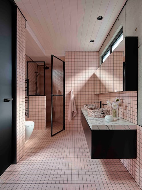
In the fashion world, dressing in monochrome, or the same tones from head to toe, is an easy way to make a statement. Unsurprisingly, the same can be said when applying the style to home decor, a trend we’re already seeing a lot of this year. While some associate monochromatic interior design with clean, crisp aesthetics, interior designer Kelsey Sundberg predicts the style going in a different direction in 2023, one infused with more softness and perhaps even a bit of longing for times gone by. “It feels like there’s maybe a cultural shift happening,” Sundberg says, “back to what’s feels natural, rooted in the real world outside of our phones, even a little bit messy or anachronistic.” Tavia Forbes and Monet Masters, the duo behind Atlanta-based interior design firm Forbes + Masters, seem to agree with this sentiment, noting that, “People typically select lighter colors for monochromatic rooms, which coincides with current color trends that are migrating toward pastels and less saturated hues.”
Nostalgia aside, another reason the trend’s gaining in popularity comes down to its versatility or as Forbes and Masters attest, its ability to be “calming while still exuding creativity and personality.” Indeed, there’s something a little je ne sai quoi about a monochromatic space because it feels like high design, but also leaves plenty of room for uniqueness depending on individual interpretation. What’s more, Sundberg assures that not everything needs to be included in the monochrome for the look to work. For example, “Wood reads as neutral, so don’t feel like you need to paint a beautiful banister to get the effect. It can actually enhance the effect of a color to have some key elements left out,” she says. If you’re still not convinced a monochrome room is in your future, read on. More designer tips on how to seamlessly create the look at home are just moments away.
Incorporate Different Textures & Materials
In order to create a successful monochrome space at home you need to incorporate a wide range of textures and materials Sundberg says. While this may seem counter-intuitive, it’s integral to adding interest to the space and in keeping with moving towards a more “tactile, layered, and cozy” home environment. Mixing velvet or leather with a high pile rug, for example, is a fairly standard design choice, but pairing the materials together in similar hues instantly makes it more dynamic.
Shade Variations Are OK (And Welcome)
If the pressure to make sure all the elements of the room match is enough to scare you away from attempting a monochrome design altogether, don’t fret. According to Forbes and Masters, it doesn’t matter if all the colors in the room are the same. “A sea of blues is perfectly fine. Also, If you want to place another color in a small dosage, consider colors on the same side of the color wheel,” they say. Besides, having everything in the same exact hue risks it looking “like a wash,” adds Sundberg. “You need to have a wide range of tones and hues.” Plus, attempting the look from this approach makes it way less intimidating.
Consider The Mood Of The Room
“The interesting thing about monochromatic design is it really allows the space to control the mood,” Sundberg says. Hence, your first order of business should be deciding how you want the room to make you feel. Consider your initial reaction to the paint swatch you picked out. “If it makes you feel warm and comfortable, that’s great for your living room, but maybe the kitchen wants to be bright and invigorating for sleepy mornings,” Sundberg adds. In this same vein, Forbes and Masters prefer using colors that facilitate calm in bedrooms, reserving more dramatic colors for formal spaces.
This article was originally published on