(Home)
12 Decor Finds That Will Get You Excited To Add Pantone’s Viva Magenta To Your Home
Its 2023 Color of the Year is here.

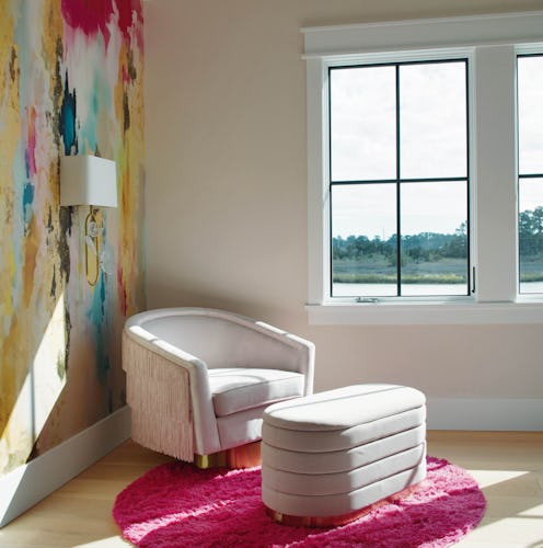
By now, it’s likely you’ve heard the news: Pantone’s 2023 Color of the Year has officially been announced as Viva Magenta 18-1750. It’s a decision that’s sparked much debate (as is usually the case). Yet while there are plenty of reasons to both love and doubt this choice of hue, there’s one thing that’s impossible to deny no matter where you fall on the matter: The raspberry-like shade isn’t the easiest to use in decor. Sure, pink has seen a surge in popularity lately thanks to Barbiecore’s rise. However, that doesn’t detract from the fact that Viva Magenta decor is a tricky thing to incorporate naturally into most homes.
That said, interior designers and experts do confirm that it’s on the up — so it is a color worth trying this year. “We have been seeing more saturated colors, and in 2023 I‘m expecting to see this heavily especially in reds, pinks, and mauves,” says HomeGoods Style Expert Beth Diana Smith. “[It] isn’t surprising to see these earth tones being taken up a notch from muted to bold.”
OK, so it’s in — but how to use it, exactly? According to Sue Wadden, director of color marketing at Sherwin-Williams, “It’s giving high drama so you’d want to use a color like this, such as Radish SW 6861, in a place where you’re seeking energy, like a kitchen island or dining room. For other areas, I recommend limiting it to accents, small doses and details, like a front door.” Christine Marvin, chief marketing and experience officer at Marvin, weighs in with similar advice, noting that adding in the color in these smaller ways “elevates everyday moments and boldly encourages us to have fun again.”
Of course, not everyone is ready to fully commit to such a rich hue. In that case, here’s Wadden’s tip: “For those who aren’t ready to go as bright as this color, I recommend more muted and darker reds, like a blackberry or merlot.” That way, you’ll still reap the energy of the color without quite so much drama.
Viva Magenta can be intimidating, no doubt, but there are many ways to incorporate it into your spaces depending on your feelings toward the hue. Whether you’re still apprehensive or ready to dive right in, follow the above tips and then continue on to shop a few of TZR’s favorite magenta decor finds.
We may receive a portion of sales if you purchase a product through a link in this article.