(Fashion)
Hermès Is Redefining Neutral Dressing For Fall 2020

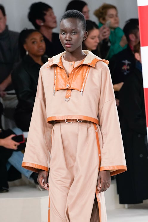
Most people know the French luxury brand Hermès for its accessories. The Birkin bag, for example, is easily one of the most iconic bags in the universe of fashion. An Hermès silk scarf is just as recognizable. But lately, on the runway, creative director Nadège Vanhee-Cybulski is giving Hermès a reputation for cool clothes that also have an extremely luxurious feel. Vanhee-Cybulski has a knack for taking age-old codes from the heritage French fashion brand and reinventing them. For instance, inthe Hermes Fall/Winter 2020 collection you’ll find plenty of leather in all different iterations — not just in the form of the brand's iconic accessories.
On Feb. 29, Hermès presented its collection during Paris Fashion Week set against a white background and color-blocked poles in shades of red, navy, green and yellow — an aesthetic perhaps purposefully similar to Hermès’ packaging for its brand new line of lipsticks. And the collection opened with a similarly light color palette. White dresses, pants, and coats were flecked with the same primary color blocking seen on the set. A bright yellow top was styled underneath an oversized pair of white trousers and matching jacket. Elsewhere, colorful primary hued blocks flanked white dresses and overtook the silhouettes of simple long sleeve shirts. Here, Vanhee-Cybulski began to show a new form of neutral dressing — using white as a base and incorporating primary colors to create a look that feels intrinsically luxurious and modern. At first glance, it’s clear that the kind of outfits that Vanhee-Cybulsk was sending down the runway are made of the same relaxed separates women already wear in their everyday lives — with a more elevated feel.
Vanhee-Cybulski applied the same concept of neutral dressing paired with power colors throughout the collection using various shades of neutral — from that stark white to rich caramels and deep, inky blacks — as the connecting theme that brought all the bright hues together. Black button-down and pleated skirts, structured trousers, and sleek blazers were all there. And while a few of them picked on the same bright colors as the white pieces earlier on in the collection, the main contrast here was brown stripes and pops of cobalt blue throughout.
The collection ended with an array of cream, khaki and gray looks, many of which also had pops of pretty bright yellows, loud reds, kelly greens and cobalt blues. Again, Vanhee-Cybulski made the unexpected decision of pairing everyday-looking khakis pants and skirts with extremely bright yellow and green tops. The brand's luxe accessories were also used to contrast ensembles, a bright bag popping against a neutral look.
The biggest takeaway from this Paris Fashion Week moment is that this is a styling trick you can all take advantage of for the long-haul. Next time you’re feeling uninspired with your neutral hued look, add an accessory in a saturated color. It instantly livens up the look and creates a totally different vibe than your typical neutral-hued look.