(Pop Culture)
How Color Plays A Secret Role In 'Bridgerton' According To The Show's Costume Designer
Ellen Mirojnick found subtle ways to build story through the sweeping gowns and flowery suits.

If you're among the millions of fans to discover Bridgerton over the holidays, then you already know that the period drama from Netflix and Shondaland is the type of show that you inhale all at once. The sumptuous costumes, dreamy interiors, and of course the romance, make the story all-consuming. While binge-watching eight episodes all at once may make it easy to pass-over the nuances, costume designer Ellen Mirojnick found subtle ways to build story through the sweeping gowns and flowery suits throughout. In Bridgerton, the use of color was an important way to both acknowledge the past, but to also draw in a modern audience.
"We created a palette that was inspired by Genieve Figgiss paintings," Mirojnick explains, nodding to the contemporary painter's highly saturated canvases. "That color palette was created for our entire world. It was fresh and vibrant. It was necessary to establish a difference between the Bridgerton and the Featheringtons."
Of course, Mirojnick is talking about the two families at the center of the show's hijinks, "The palette for the Bridgertons was meant to feel romantic and refined. The Featheringtons, being new to the town and not from the same societal background, were always described in the text as wearing acidic colors." She explains. "We chose a palette to incorporate a Versace-esque feeling. We felt that was a perfect way to create the Featherington characters."
Period dramas like Bridgerton (which takes place in Regency-era London, around 1813), often use costume to create a historically accurate world in which characters exist, with stories like Pride & Prejudice and Emma often serving as popular examples of such. But, what sets Bridgerton apart, is that it eschews historical accuracy for a more symbolic sense of fashion, especially as pertains to color. Scandal, another popular show helmed by Shonda Rhimes, helped to establish an era of television where the clothing told a story all its own — using Olivia Pope's white suit as a message of power.
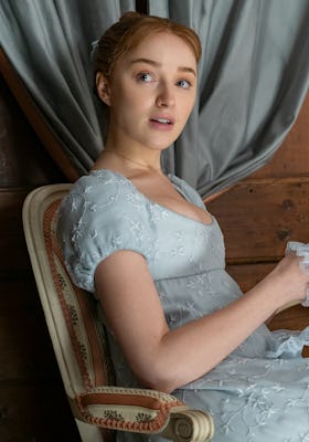
"A historical color theme was not relevant for creating our world," Mirojnick says. "The palette became the first step in creating our color bible, then we went from there. For example, the color Wedgwood blue became our symbol for the Bridgertons — we used it not because it was historical, but it fit into our story." Beyond the calm often associated with a blue color palette, Wedgwood, the fine china porcelain manufacturer first founded in 1759, nods to a certain level of luxury and status held by the family.
But, in addition to the ways color is used to establish a sense of place for each family within the Bridgerton world, it can also be used to convey change and growth. "As Daphne becomes the duchess, her innocence fades and evolves," Mirojnick explains of Daphne Bridgerton, whose romance with the Duke of Hastings serves as the central plot to the season. "We took her palette into a deeper and duskier tonality. It was subtle, but you feel that Daphne has become a woman." In a show that's filled with opulence and drama, something as subtle as a shift in shades may be easy to overlook, but it establishes a level of detail that makes the show worthy not only of tearing through once, but of revisiting for a closer look.