(Living)
This Controversial Home Decor Trend Is Genius When Done Right

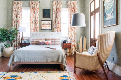
Surely you've had the experience of walking by someone on the street and admiring their impossibly effortless mixing and matching of patterns: a plaid sweater pulled over a leopard print dress in a way that seems to make all the sense in the world — and yet it's totally over your head when it comes to your own personal styling. The same might be true for your home, as well. While so many people currently covet a transitional or eclectic style these days, knowing exactly how to mix decor prints seems to still be evasive to those who aren't professional decorators.
As is the case with fashion, print mixing with your interior decor doesn't have to feel so out of the realm of possibility — especially when you've got a few handy tips from the experts in your back pocket. And what's more, once you know a few ground rules, you can use a combination of patterns to make any room more dynamic, even if you favor a minimalist style.
So how do you do it in your own home, regardless of your personal style? Ahead, find some simple print mixing guidelines as recommended by top interior designers and stylists that will help you create a space that's worthy of being featured in your favorite design mags (well, you can dream).
Stick With Similar Colors
Experts agree that an easy way to make differing patterns work together is being strategic when you're choosing colors. "Use similar colors when mixing patterns," says interior and event stylist Abby Pendergrast, who recently used this technique in a chic nursery. "By keeping the palette cohesive and the prints varying, it still has a fun and unique feel without looking too over-the-top."
“I always experiment with tonal colors, versus trying to match colors exactly in each print," adds Charleston-based designer Cortney Bishop of Cortney Bishop Design. "Working with multiple shades of one color creates depth between the patterns.”
Switch Up The Scale
Another way to make things feel harmonious despite the eclectic nature of pattern mixing is by combining different scale prints. "Make sure that some of the prints are smaller while others are a larger and bolder in scale," Pendergrast says. "This also helps to visually balance." And Shannon Wollack, founder of West Hollywood's Studio Life.Style adds, “Never mix two large prints or two small prints alongside of each other because they will bleed together and not give the overall design the magnitude that is needed.”
As far as a few easy options to try, Bishop recommends starting with a classic that almost reads as a neutral. “Small polka dots are the texture equivalent to the color black," she explains. "They go with everything!” And Wollack suggests a basic stripe with a large-scale print (like a blown-out floral) for no-fail combo. "This brings character and color to the space in a subtle but stylish way,” she says. Wallpaper is a bold way to try this technique — even if it's just on one wall.
Seek Out Texture
Bishop also notes that texture can be a form of print — which is especially helpful if you're going for a minimal look, but still want to create visual interest. “Texture in sofas, drapes, and rugs thrive when layered with contrasting scaled prints,” she says.
Keep It Grounded
To avoid print overload, Pendergrast suggests making sure there are some solid surface areas to create a grounding effect. "Whether it's a solid print sofa or neutral bedding setting the tone with a good solid is great layer pattens with abandon," the designer explains.
This article was originally published on