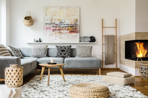
(Living)
The Common Decor Mistake Designers See All The Time

When decorating your home, the options can be overwhelming — specifically when you're reading tips, tricks, and suggestions from various sources while simultaneously trying to figure out your own needs and tastes. And while considering options of what you could try in terms of decor might be useful as you start shopping for furniture and accessories, it could be just as beneficial to weigh in what not to do. For example, by avoiding common living room design mistakes, this frequently used area of your home can be transformed into both a beautiful and totally functional space.
There are so many factors to consider if you want to create your ideal living room, not the least of which are lighting, paint color, what to put on your walls, and finding furniture that's as useful as it is aesthetically pleasing. And a clever way to go about your shopping, arranging, and accessorizing is to learn about the biggest faux pas from the pros. Ahead, find a few of the most common mistakes you can make with your living room decor — as well as why it will benefit you to avoid them — according to a few top designers.
Not Measuring First
It's easy to fall victim to this cardinal design sin. You get excited and order something without factoring in whether it will fit within your living room's dimensions, or how it will coexist with other sized pieces. "The scale of furniture can be tricky and sometimes an exact fit can be a matter of inches." explains Chicago-based interior designer Cari Giannoulias. Her best advice? "Gather all measurements, as well as a picture of the piece to confirm that the perfect chair is indeed just that."
You'll also want to know the heights so you can play with laying, according to Tulsa-based designer Mel Bean. "One of the ways we do this is by choosing a higher back chair near a window with grand drapes and adding a small side table and floor lamp of varying heights," she says. "A low-back sofa may feel too small in a space, but add a pair of contemporary pharmacy floor lamps and suddenly the sofa feels more proportional to the volume of the space."
Shopping Only At One Retailer
It can be tempting to scoop up everything you need to buy from just one brand or retailer in the interest of time and convenience. But Giannoulias argues that the best living rooms are those that mix it up. "You as an individual are so multi-faceted so how could your home be one dimensional?" she says. "If you love the aesthetic of a certain retailer, incorporate pieces that make a statement about who you are but then pepper in different layers from other retailers, family heirlooms, antique stores, etc. that speak to your various traits."
Not Editing
Knowing when to scale back is just as important as finding pieces you love. "If you have too many furniture pieces or accessories, then it draws attention away from the special ones," Giannoulias explains. "Once you have a finished a room, take a step back and make sure each item has breathing room. If not, remove one item at a time until you get the perfect balance."
The designer believes this especially applies to shopping very trendy pieces. "Everyone loves to see what's new and of the moment, however adding too many trendy items to your home could make a space feel chaotic not curated," she says. "Try limiting yourself to one or two new ideas that appeal to you and don't break the bank on these items. Chances are, you will tire of them within the year."
Skipping The Details
"There is nothing that will distract your attention more in a room than missing the details," argues Giannoulias. "For instance, wallpaper installed improperly, floor lamp cords running across a room, art placed too high. These can sometimes be the first thing that guests notice even though the room is beautiful."
And Kenneth Boyer of Los Angeles-based Atelier K believes an often overlooked detail includes window treatments. "Whenever possible, lining and interlining are essential," he says. "This allows the draperies to hold their form and is a great way to protect the draperies from sun exposure. When you install your drapery rods 1/3 from the ceiling to the window casing it draws your eye upward, creating a visual of height."
Not Layering Your Light
"There is nothing cozy or welcoming about row upon row of recessed and downlight which adds sharp shadows to your face and glare to your eyes," explains Bean. "I use layers of lighting which usually include indirect lighting in the form of wall-washing recessed lights to highlight art and architectural details, a statement central decorative fixture such as a chandelier, and gorgeous accent lighting such as table and floor lamps. I also use dimmers everywhere!"
Favoring Form Over Function
It's great to find pieces you think are beautiful, but it's important to think about how they're going to function in your space. "The design has to be a balancing act specific to each client, while also achieving a balance of function and beauty" Bean says. "One way we do this is by using beautiful indoor/outdoor fabrics for clean-ability/durability. The furniture we select must also be comfortable and beautiful and retain it's shape well."
According to Boyer, you should also consider how you want to flow through the space. "Leaving 36 inches for pathways and 24 inches between furniture pieces is standard spacing," he says. "Depending on the room layout, 14-inch to 20-inch spacing between the sofa and coffee table is a general range."